Cropped Will Cardini artwork

April 3rd, 2014

Cold Heat Special #10 Debuts this Weekend at MoCCA 2014

Filed under: Events,Print Comics — Tags: , , , — William Cardini @ 10:42 am

I’ve been honored to write and draw Cold Heat Special #10 with the input of Frank Santoro. Sacred Prism, Ian Harker’s publishing outfit, is debuting the two-color, 5×7″ risograph-printed comic this weekend at MoCCA Fest 2014 in NYC. If you can’t make it to MoCCA, you can preorder the issue. You can also subscribe to all eight comics that Sacred Prism will publish in 2014.

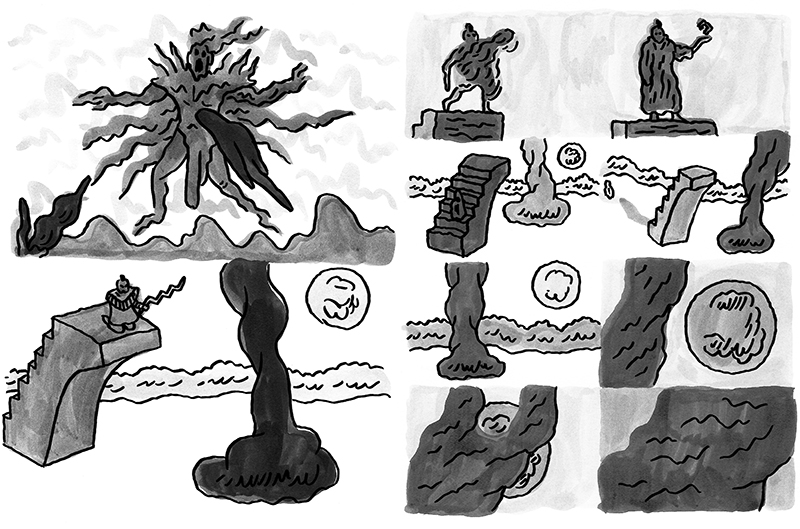
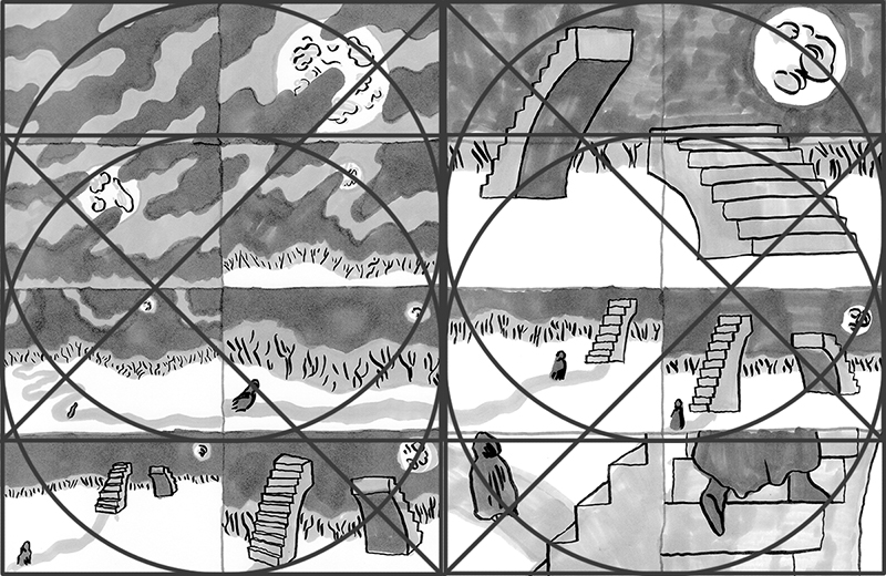
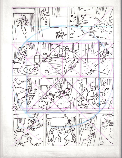
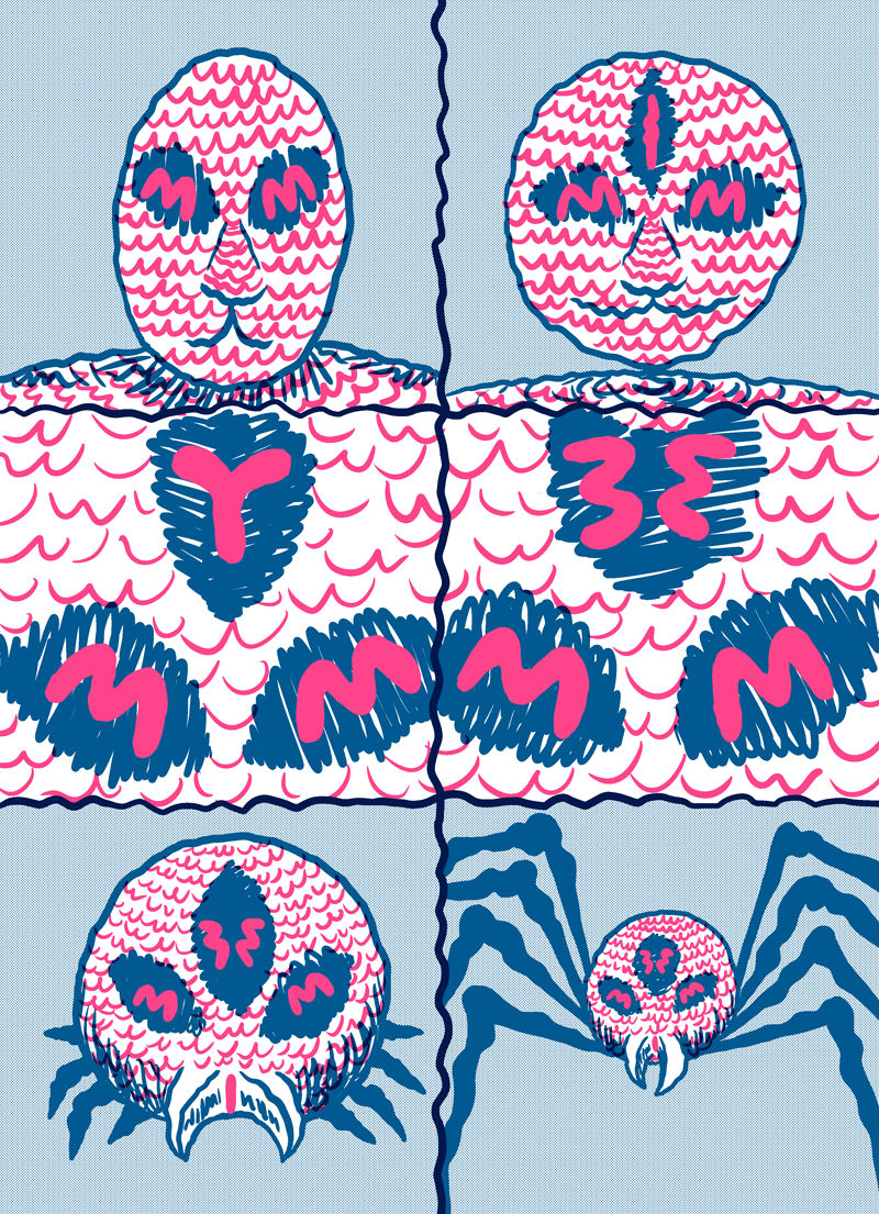
Here’s a photo of an uncut printed page:

Cold Heat Special 10 Print Photo
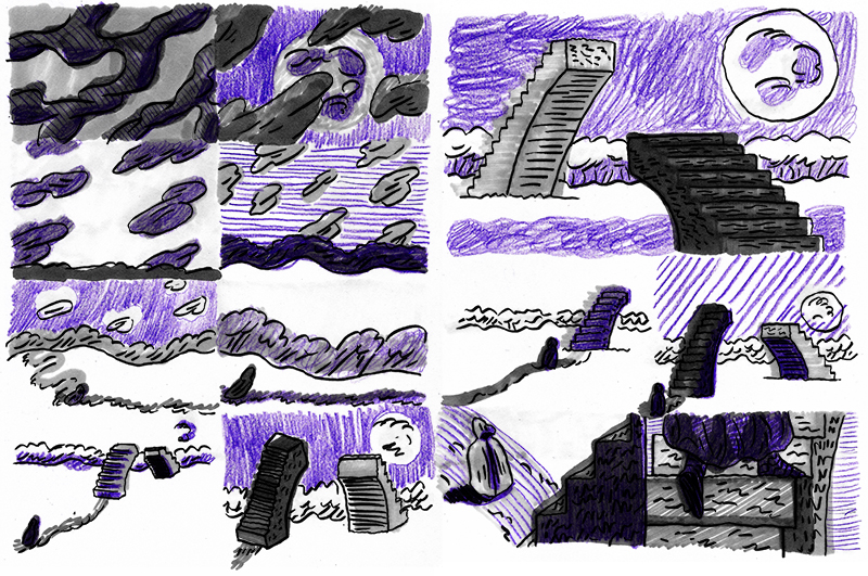
You can see, clockwise from the upper left, the back cover, front cover, Page 6, and Page 7.

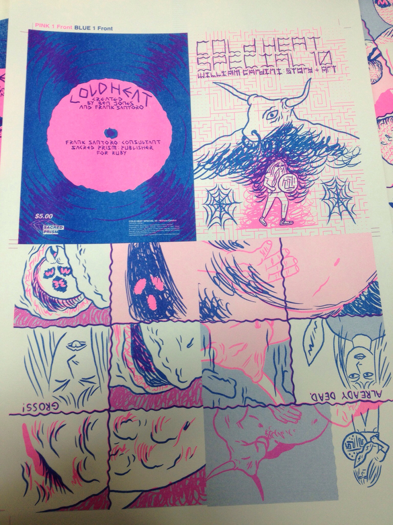
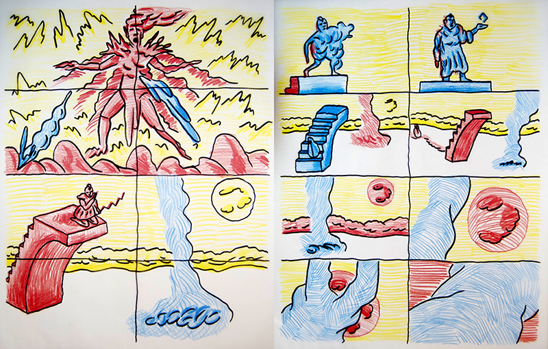
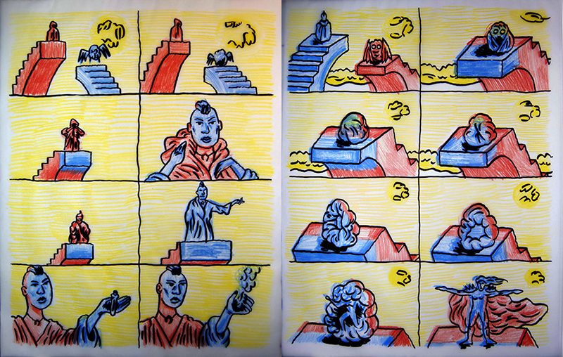
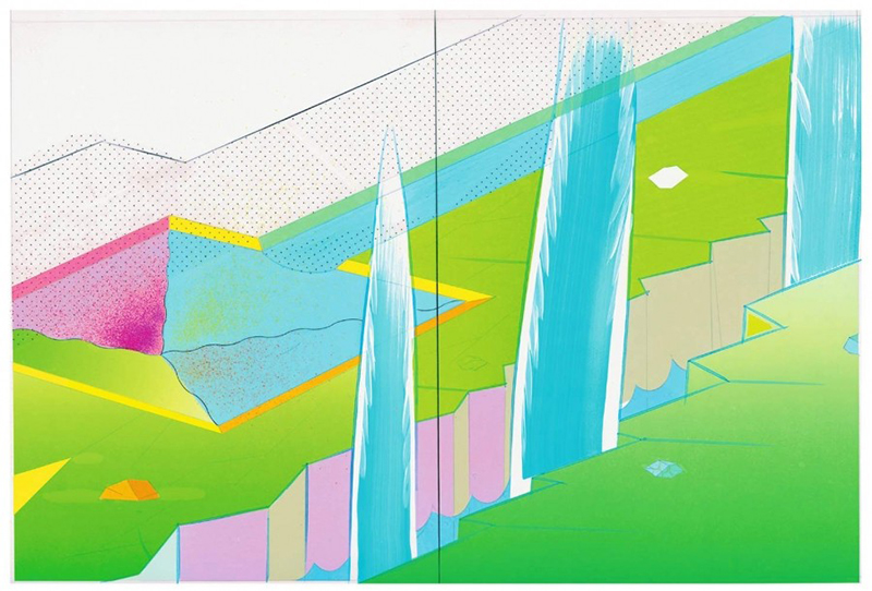
I’m really happy with how the colors are mixing together. I was worried the purple wouldn’t be visible enough against the blue on the back cover… and that pink pops on top of a 25% blue screen! Here’s a Photoshop simulation of a printed page (via multiplied layers):

Cold Heat Special 10 Photoshop Simulation
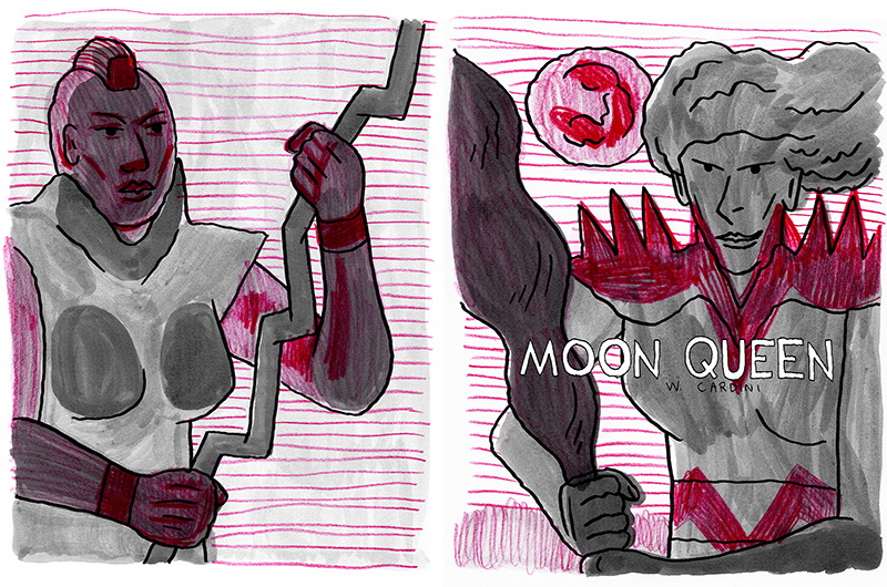
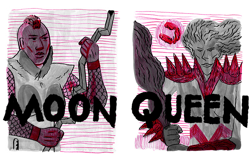
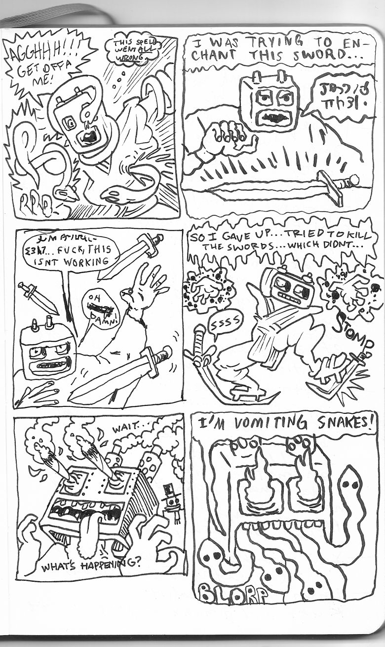
Page 1, which is also partially visible in the top-right corner of the previous image.

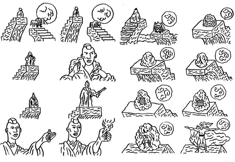
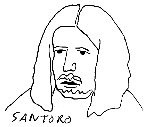
If you’re unfamiliar with Cold Heat, it was a comic book series written by Ben Jones, drawn by Frank Santoro, and published by Picturebox. Frank worked with a bunch of other fabulous cartoonists on the first nine Cold Heat Special issues, which were side quests starring the protagonist, Castle. You can read the first six issues of Cold Heat for free, and order the non-sold-out specials, here. I’ll let y’all know when I have my contributor copies of Cold Heat Special #10 up for sale in my store.

P.S. Two new pages of Skew were posted on Study Group this past Monday.

July 24th, 2012

Vortex #3 Cover Preview

Filed under: Inspiration,Print Comics — Tags: , , , — William Cardini @ 7:06 am

I’ve started Vortex #3. Here’s a possible cover:

I’ve been looking at classic Jim Starlin mind trips for inspiration. Like Page 52 from the collection The Life and Death of Captain Marvel:


This page is from #28 of Captain Marvel. I got this scan from this blog post.

Here’s that Starlin page with Frank Santoro’s golden section diagram:

Look at how all of the lines converge in those two light blue/white panels in the center. And that center diamond perfectly frames the skull! Frank’s made me a believer!

February 17th, 2012

“Moon Queen” B-Sides: Spreads 5 and 7

Filed under: Sketchbook Pages — Tags: , , , — William Cardini @ 7:45 am

Here’s the final set of process shots from Moon Queen, the comic I drew during Frank Santoro’s Correspondence Course:

Moon Queen Spread 5 B Side
Original sketches for Spread 5.

Moon Queen Spread 7 B Side
Spread 7, ink wash layer with loose blackline.

Moon Queen Spread 7 B Side
Spread 7 fore-, mid-, and background in colored pencil.

February 14th, 2012

“Moon Queen” B-Sides: Spread 3

Filed under: Sketchbook Pages — Tags: , , , — William Cardini @ 7:35 am

Here are some process shots from Moon Queen, the comic I drew during Frank Santoro’s Correspondence Course:

Moon Queen Spread 3 B Side
Original sketches for Spread 3.

Moon Queen Spread 3 B Side
Spread 3, gray markers with blackline and geometry overlay.

Moon Queen Spread 3 B Side
Detailed blackline for Spread 3.

Moon Queen Spread 3 B Side
Spread 3 fore-, mid-, and background in colored pencil.

I’ll have one more set of B-sides for y’all on Friday.

February 10th, 2012

“Moon Queen” B-Sides: Cover Spread and Spread 1

Filed under: Sketchbook Pages — Tags: , , , — William Cardini @ 7:17 am

Here are some process shots from Moon Queen, the comic I drew during Frank Santoro’s Correspondence Course:

Moon Queen Cover Spread B Side
First version of the final cover spread.

Moon Queen Spread 1 B Side
Spread 1, gray markers with blackline and geometry overlay.

Moon Queen Spread 1 B Side
Color test of Spread 1.

I’m going to post more next week.

February 7th, 2012

“Moon Queen,” my Comic from Frank Santoro’s Course

Filed under: Web Comics — Tags: , , , — William Cardini @ 11:38 pm

Hey y’all, this post is late in the evening on Tuesday because I’ve been busy finishing the comic I made during Frank Santoro’s Comics Correspondence Course, coding an HTML shell for it, and uploading it to this site. The comic is called Moon Queen. Click the cover spread to read it:

Moon Queen cover spread

I tried something different with the navigation. Because Santoro had us thinking about the spreads so much, I wanted you to be able to see both the spreads and the details. So on the index, you can see all of the spreads. Then you can use the next and previous buttons on the side to proceed through larger images of the spreads. You can also click on either half of the spread to see the page up-close. You can navigate between the page views but once you get to a new spread, you see it all at once. What do y’all think? It makes sense to me but I thought of it so I’m not be experiencing it as a first-time user would.

Santoro Correspondence Course

As some of you may know, I’ve been drawing all of my comics completely on the computer for the past couple years but Santoro had us draw everything in the class by hand (although I assembled the final comic in Photoshop). I’d been wanting to get back to doing some analog drawing so I was glad to take a break from the flickering screen. All in all, the process that Santoro taught us was fascinating. I learned a lot of things that you’ll see me experimenting with in future comics. If any of y’all are thinking about taking future sessions of Santoro’s class and are willing to try out a new approach to making your comics, I highly recommend it!

December 13th, 2011

A New Direction for my Comics

I’m by myself at the house drinking coffee in the early afternoon on a Saturday, trying to burn through some Google Reader items, getting ready to work on some comics, my mind is really buzzing, and I just need to list it all out somehow so I’m posting about it here.

Here’re my inputs:

Blaise Larmee
A representation of some panels from Blaise Larmee’s 2001.

Matt Seneca’s Weeklong Interview with Blaise Larmee – I’m reading this and trying to understand specifically what Larmee is saying. It’s difficult because he can be obtuse but he drops a lot of nuggets in there like “Cartoonists need to be willing to abandon comics.”

Ryan Lauderdale Mashup
A mashup of three different pieces by Ryan Lauderdale that look like abstract comics to me.

Ryan Lauderdale’s Show, Bed Bath and Beyond, at Nudashank – My friend Ryan is getting his MFA is Brooklyn right now and has a show up at the Nudashank art space in Baltimore. This week we talked about how important form, color, and spirituality are to our work, about reacting against postmodernism with a revived modernism (or something else), about color field painting, all these things that I’m into that I sometimes forget about when I sit down to draw comics.

Frank Santoro Geometry Exercise
A geometry exercise from Frank Santoro’s course. We had to figure out the geometry behind a page of Tintin.

Frank Santoro’s Comics Correspondence Course – I’m taking Frank Santoro’s course. It’s a lot of work but I’m learning a lot of things. His geometry stuff is really interesting – it’s the scaffolding of comics or it’s abstract comics when you look at it on its own. Frank’s pushing me to be more creative with my mark making, which is good for me.

Yuichi Yokoyama Page from Color Engineering
A page from Yuichi Yokoyama’s book Color Engineering.

Yokoyama’s Color Engineering and an Interview with Yokoyama by Seneca – Man, Seneca has been on an interview roll lately! And they all get my brain boiling. He’s one of one of the best writers about comics because he focuses so much on the visual. Also his enthusiasm is infectious. I’ve posted about Yokoyama before – his work is a big inspiration for me. I think it’s interesting that both he and Larmee say in their interviews with Seneca that they don’t read anyone else’s comics. Personally I find it really important and invigorating to read all of the great comics that are being published these days but I do have to space it out a bit because if I read too many comics, the work that I make it influenced too strongly by them. So mostly I read sff books.

Screenshot from ____ by Terry Cavanagh
A screenshot from the indie video game ____ (A.K.A. Four-Letter Word) by Terry Cavanagh.

____ by distractionware – Reading Wiley Wiggin’s post about ____ and then seeing the screenshots made me really excited about this game, and just the idea of an incredibly abstract and difficult-to-play game in general. I don’t post about it very much on here but interactive art is something I’m really interested in and from the looks of it, this game gets me excited about it again.

My output from all of these inputs is still brewing. Hopefully it’ll bubble out over the next few months and years. Right now I’m just thinking, as Darryl Ayo reminded me in this Comix Cube post, that it’s important for me to look at my aesthetic interests outside of comics and bring those in. Break out a bit from the Fort Thunder influence that’s so evident in my work and find some mashup of color field painting, expressive mark making, net art, and sff that’s more my own.

April 13th, 2010

MoCCA 2010 Recap

Filed under: Recaps — Tags: , , , , , — William Cardini @ 7:37 pm

MoCCA was a blast this year, as always. I got a tonnnnn of awesome-looking minicomics, newsprint comic anthologies, and other books. I was glad that it was in April this year rather than June – NYC in June is too much like Austin in June, but NYC in April is a nice cool break from the high temperatures that are already here in Texas.

The only panel that I went to was Frank Santoro and Dash Shaw in Conversation. They talked mainly about color in comics, and how it differs from color in a painting. Frank talked about how he puts together a page of Cold Heat, which was fascinating. He really made me see how offset comics are a form of printmaking just like serigraphy. I came away with a lot of good ideas for my next project, which you’ll hear more about later…

While I was in NYC I finally got to meet my collaborator Josh Burggraf in person. I chilled with him at the Supertalk Comix table (where we had copies of SHAMAN THUNDER for sale), met the Supertalk d00dz and drew this jam comic:


Panel One: Josh, Panel Two: Me, Panel Three: Victor Kerlow, Panel Four: Josh, Panel Five: Jeremy Povolny, Panel Six: Me

On Sunday I went to the MOMA, where there’s a William Kentridge show up. He always makes me want to buckle down and get some animation done. I’d seen his angrier videos before but I also saw some that were more mournful and beautiful, as well as some amazing playful ones that reminded me of early cinema.

I didn’t end up unloading all of my copies of SHAMAN THUNDER so if you want one let me know. We’re selling them for two dollars.

July 7th, 2009

Commmix in th’ MAIL

Filed under: Inspiration — Tags: , , , — William Cardini @ 11:20 am

I just got The Moth or the Flame by Joshua Ray and Follow Me by Jesse Moynihan in the mail yesterday.

I started reading Follow Me last nite and its dope! Then I went to Jesse Moynihan’s website and lo and behold, it turns out he makes a totally crazy full-color webcomic about our Atlantean past. It’s called Forming, here’s a quote from the summary:

Central golden boy Mithras, lands in Atlantis around 10,000 B.C. Within a hundred years he has transformed the Atlantean population into a slave force to mine Earth’s precious minerals. He has children with human labor captain Gaia because the freaky star-shaped birthmark on her face is a sign of the elements. Their offspring are gifted with awesome abilities but the children, in general, creep Mithras out.

One such child, Arges, stumbles across the head of a dead dog in the forest. The head is possessed by a channeling entity. He warns, “You can no longer trust your father.”
“That’s what my sister said.” Arges replies.

In Canaan another alien, Serapis the Androgyne, arrives with a group of creatures cloned from his DNA, The Nephalim Guard. They encounter Adam & Eve and begin a period of observation and stealth known as OPERATION: HEAVENLY SWORD.

Also be sure to check out Frank Santoro’s notes on Mat Brinkman’s MULTIFORCE, here’s a great quote from the end:

The pieces of the multifaceted storyline grow together and create a life of their own. The web that’s fastened is a solid structure, a jewel that reflects each point of the story as it turns. Like some galaxy contained in an aquarium, Multiforce vibrates beyond the comic book page. Mat Brinkman may be the spiral architect of this generation of cartoonists.

June 16th, 2009

MoCCA Part Two: Cartooning, FS, and GP

At MoCCA Fest 2009 I started thinking about cartooning as a craft distinct from comics that I don’t practice that much. I’ve only developed a couple of ways of drawing cartoon faces that I slightly modify and draw over and over again. Scratch that, actually I just have one:

Mark’s face.

It’s pretty simple, really. Rudimentary, actually: one straight line, one Z, and then some wiggly lines for hair, beard, and so on.

I think that it was flipping through the Sam’s Strip book and looking at all of Jerry Dumas’ really elegant cartoons, but for whatever reason, I came to the conclusion that, perhaps, one straight line, one Z, and at least nine wiggly lines just wasn’t a true expression of cartooning expertise.

So, I began drawing cartoons of Frank Santoro and Gary Panter while I was waiting for their panel at MoCCA to start (for a great overview of that panel, be sure to check out this squally showers post).

Here are my two favorite likenesses:

(Paraphrased quotation from Gary Panter added later, after the panel had started. Another awesome thing that he said: “The future will be like terminator except the robots will look slick like tennis shoes.”

via hypebeast.)

Anyways I think that I’m gonna spend some time developing my cartooning chops. Looking at Sam’s Strip also got me thinking about doing a weekly comic harking back to the pure idea behind the daily newspaper strip:

Six panels where the same thing happens over and over again in different ways. I’ve always wanted to do a strip like this but I’ve always been stalled by what is, for me, the core of it all: the repeated action.

I tried it out with my Daily Texan strip, “Fists.” The idea was that someone would get hit by a gloved fist on a stick every comic, an idea that owes its existence to Ignatz’s brick.

Of course, nothing about that comic ended up being standardized except for its iconography, which I still like and want to bring back some day:

Like the materials-based sculptures and performances that I used to do, this iconography is something that I came up with back before I got so heavily influenced by Fort Thunder. So many ideas, so little time. We’ll see how much of this comes to fruition, I’ve got a looooong to-do list.