Cropped Will Cardini artwork

June 3rd, 2011

Three Kewl Local Kickstarter Projects

Hey guys, I just donated to some kewl local(ish) Kickstarter projects that friends of mine who do good work are involved in and I thought I’d let you know about them:

Click here to read more about these three kewl local Kickstarter projects

March 22nd, 2011

2001 Nights by Yukinobu Hoshino and Tone Sheets

Filed under: Artwork,Inspiration — Tags: , — William Cardini @ 7:15 am

Man, SXSW was crazy – 25th anniversary and the biggest year yet! I only went to a couple of shows. The highlights of my South By this year were What’s Tappening, Chica Vas, and Harsh Realm II at Monofonus.

Anyway last week I mentioned how I got three volumes of 2001 Nights by Yukinobu Hoshino. Now I’m going to post the my favorite examples of tone sheet usage and show you what they inspired me to make.

I love the gas giant (is it a processed photograph?) and the circles of light from the propulsion of the ship on the right in this page:

2001 Nights by Yukinobu Hoshino
A page from the chapter “Night 6: Discovery” in 2001 Nights by Yukinobu Hoshino.

The gradient tone sheets on this spaceship blow my mind:

2001 Nights by Yukinobu Hoshino
A page from the chapter “Night 7: Lucifer Rising” in 2001 Nights by Yukinobu Hoshino.

Click here for more pages from 2001 Nights and my tone sheet experiment

March 15th, 2011

From Anarchadillo in Austin to Renaissance Books in Riverside

Filed under: Inspiration — Tags: , , — William Cardini @ 10:57 pm

My family recently made our roughly annual pilgrimage to Riverside, California to visit relatives. Whenever we’re there, we always stop by Renaissance Books, a used book store with a huge sf section (you can buy stuff from them online here). The owner used to live in Austin and ran a used book store/head shop here. This trip I found out that his shop used to be down the street from where Glade and I live. It was called Anarchadillo: Slow Burning Books and Papers. Gotta love that. I tired to find a photo but I was unable to. If anyone has one, I’d love to see it.

Here are some gems I picked up:

Paul Lehr cover of The World of Null-A by A. E. van Vogt
Paul Lehr cover of The World of Null-A by A. E. van Vogt.

Lehr also did this cover of Solaris. They had a couple other books with Paul Lehr covers and they were all dope. As far as the novel goes, I love this story and most van Vogt in general. His stuff is pure superheroics. Similar in tone to Fletcher Hanks sometimes, at its most manic and exciting. Definitely obsessed with power and authority.

Starshine by Theodore Sturgeon
Starshine by Theodore Sturgeon, cover artist unknown.

I haven’t read any Sturgeon but Aldiss made him sound like a great author in his must-read history of sf, Trillion Year Spree.

Impossible Possibilities by Louis Pauwels and Jacques Bergier
Impossible Possibilities by Louis Pauwels and Jacques Bergier, translated from the German, cover artist unknown.

I really wish this was an sf novel. I’m not sure what it is – futurism? weird pseudoscience? I probably won’t end up reading it.

I also got some awesome comics:

  • An old Epic Moebius graphic novel, containing the story Upon a Star that he did for Citroën, serialized online here. It’s one of my favorite Moebius stories.
  • A volume of the Akira serialization that’s been colored by Steve Oliff. You owe it to yourself to click that link if you haven’t seen Oliff’s original color guides.
  • The three volumes of 2001 Nights by Yukinobu Hoshino. I really dug this series. I like near future hard sf (although the science in these isn’t that thoroughly researched). I think it’s because it seems hopeful about our future but is still grounded in what we know. I like that kind of story because I also know it’s something I would never have the discipline to do the research for. I just don’t have the patience or attention to detail. I’d really like to read something that takes into account all the recent exoplanets we’ve been discovering. Anyway, I love how Hoshino used different tone sheets to create a lot of variation in his black and white drawings. I think I’m going to try that out.

February 8th, 2011

Dungeon Crawl Stone Soup + Fort Thunder = Procedurally Generated Comics

It’s less than two weeks before my wedding, so of course I’ve become addicted to an ever-changing fantasy action RPG with a massive online community. I’m not talking about World of Warcraft – I’m talking about the free, cross-platform, and open-source roguelike Dungeon Crawl Stone Soup.

Dungeon Crawl Stone Soup Title Screen
Dungeon Crawl Stone Soup title screen

Click through to read more about roguelikes and how playing them is like reading a Fort Thunder comic

February 4th, 2011

Peter Haars Book Covers

Filed under: Inspiration — Tags: , — William Cardini @ 7:26 am

While looking at Stanislaw Lem books covers to illustrate my previous blog post, I came across Peter Haars’ work. He’s a Norwegian graphic designer who did book covers, comics, and other artwork. I couldn’t find any of his comics, which is a shame, because if they’re anything like his book covers, I’m sure they’re amazing.

He’s got several interesting themes running through his covers. Here you can see the eye-in-landscape theme:

C.S. Lewis: Reisen til Malacandra. Publisher: Gyldendal Lanterne 1975. Cover: Peter Haars.
via svenneven’s flickr.

He’s also got a nice theme of human faces melting into inanimate objects:

Kurt Vonnegut: Sirenene på Titan. Publisher: Gyldendal Lanterne 1974. Cover: Peter Haars.
via svenneven’s flickr.

Click here to see more of his covers

January 21st, 2011

Mati Klarwein Landscapes

Filed under: Inspiration — Tags: — William Cardini @ 7:30 am

I’ve been thinking about the landscapes in my comics and paintings a lot, about how I really need to push their otherworldliness to the next plane. Mati Klarwein’s landscapes, which I saw on Brenna Murphy’s tumblr, have definitely given me some forms that I can riff on.

I think this first one is my favorite. There’s just something really appealing to me about terraced landscapes (which this guy paints a lot of).


Original enclosure.

This next one is less striking because, as Glade said, it’s all details and no central image, but man I could get lost in those details:


Cropped because of watermark. Original enclosure.

This last one has a ton of stuff going on. I really like how some prominent features (glowing golden figure, cube) are hidden or obscured by all the lush vegetation. Also, what about that sky?


Original enclosure.

January 14th, 2011

The Four-Color Process Gallery

Filed under: Inspiration — Tags: — William Cardini @ 7:21 am

I’ve been thinking a lot about comic book coloring processes recently, just letting myself brainstorm how I would print a so-far imaginary color epic. As part of this, I’ve been researching older methods for getting a lot of colors out of a few different inks. So, I was particularly struck by this Four Color Process site that Dan Nadel linked to at the end of December. Here are a few images and a quote from their manifesto (written by John Hilgart):

…in [a] decisive, paradoxical twist, [the] four-color process created a form of depth even as it fought against illustrative realism. Whereas contemporary reproductions of mid-century comic art are truly closed and flat, old comic books are visually leaky and deep. Four-color dots perforate the flat surface of the universe, opening onto nowhere – some uncharted cosmos.

Click here for more

January 11th, 2011

My Fave Cartoonists of 2010

Filed under: Inspiration — William Cardini @ 7:37 am

Now that I’ve done the looking forward post, it’s time for the looking backward post. Rather than recap my own year, which y’all have already heard about in realtime on this blog, I decided to present four cartoonists that really inspired me in 2010, in no particular order: Brandon Graham, James Stokoe, Michael DeForge, and Angie Wang.

Click here for more discussion and images

October 12th, 2010

Review of Hypermorph on The Great God Pan Is Dead

Robert Boyd reviewed my show Hypermorph at Domy Books Houston on his blog The Great God Pan Is Dead. I appreciate his thoughtful review, you can read it here.

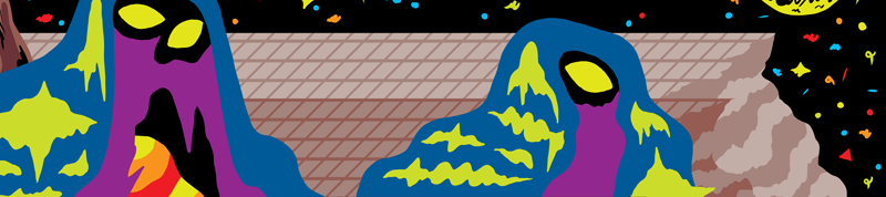
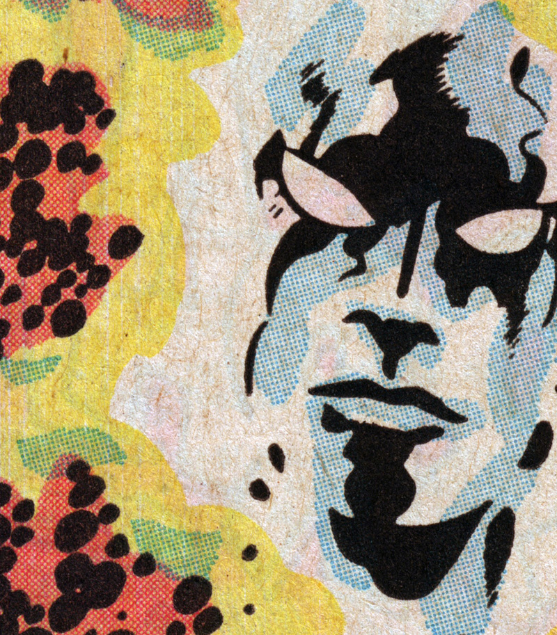
In his review, Boyd quotes my description of the Hyperverse from the press release and then says that his “first reaction to this is that it seems pretty dumb.” Ha! I can dig that. Boyd goes on to say that, what makes my approach to genre dumb is that, unlike the Fort Thunder artists that I am (all-too clearly, I know) influenced by, my work lacks does not take genre ironically or satirically. Well, that’s true. I definitely take genre, even the most ridiculous parts of it, extremely seriously. If you want me to get all metaphorical on you, I feel like I do live in, to quote my description of the Hyperverse, “a realm filled with immensely powerful inhuman beings who battle over worlds with strange geologies and hoard advanced technologies” where “mountains shift from molten to crystal between moments and clumps of rock are inhabited by malevolent intelligences ready to hurl face-melting spells,” a cosmos of constant flux, “of constant magical warfare.”

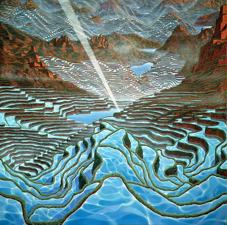
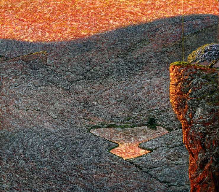
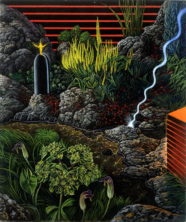
I mean, look at these photos by Edward Burtynsky:

I’m just reflecting the world as I see it.

And I have a response to Boyd’s final question:

So, if creating boyish sci-fi worlds is an aspect of the whole Fort Thunder aesthetic, can we say that aesthetic is inherently male? And if we accept that, is there a female counterpart? And if so, are plush frog heads a part of it?

I definitely wanted Glade to be a part of my show. I’m well aware of how much of a “boy’s club” all of the collectives that I am a part of (Totally Wreck, The Gold County Paper Mill) slash admire (Okaymountain, Fort Thunder), with some exceptions, are, and it’s something that I don’t like about them. All I can say is, I am going to make sure that my first long-form comics narrative passes the Bechdel Test.

October 1st, 2010

Berserk by Kentaro Miura

Filed under: Inspiration — Tags: — William Cardini @ 7:25 am

Yesterday I finished volume two of Prison Pit by Johnny Ryan. I had read an interview with JR somewhere on the interwebs where he said that Kentaro Miura’s Berserk was an influence, so when my buddy and I were at I <3 Video deciding what anime to rent, I had to pick up the first disc of the Berserk anime series. It was pretty good, but now I really want to read the manga.

I mean, check out this page:

Look at how ridiculously large the main character’s sword is. I’m working on a similar character design so I’m taking notes.

Really though, this last drawing just kills it. I’m ordering all 34 volumes of the series that have been translated into English so far.