Cropped Will Cardini artwork

January 31st, 2017

Tom Grindberg’s Thick Lined, Bulky Superheroes in 1993 and 1994

Filed under: Comics Criticism — Tags: , — William Cardini @ 9:41 am

In 1993 when I was a kid, Tom Grindberg was a guest penciler for two issues of my favorite Marvel superhero series: Silver Surfer #84 and Spider-Man 2099 #14. I hated his artwork then because it was such a radical departure from the thin lines of Ron Lim and Rick Leonardi.

Spider-Man 2099 #14 by Tom Grindberg
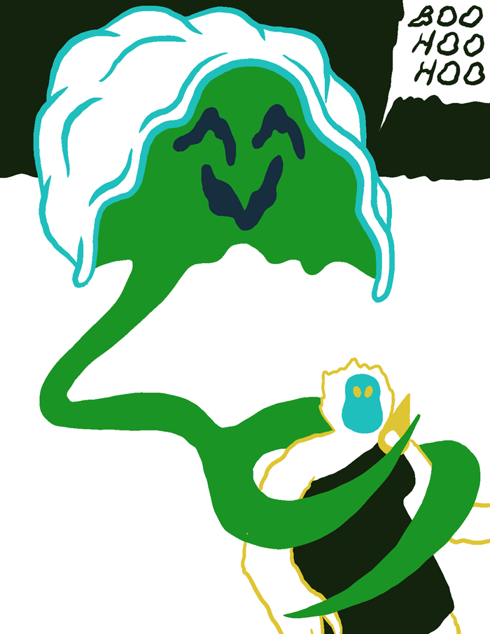
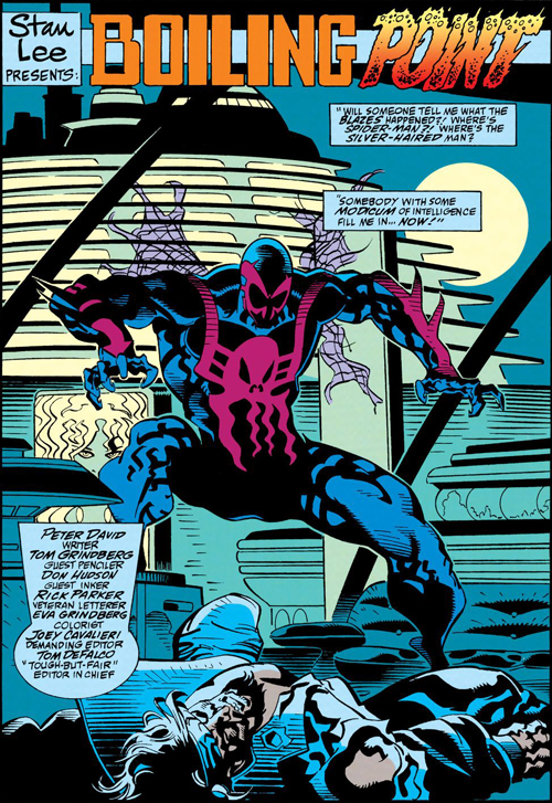
A splash page from Spider-Man #2099 #14. Artwork by Tom Grindberg, penciler; Don Hudson, inker; Eva Grindberg, colorist; and Rick Parker, letterer.

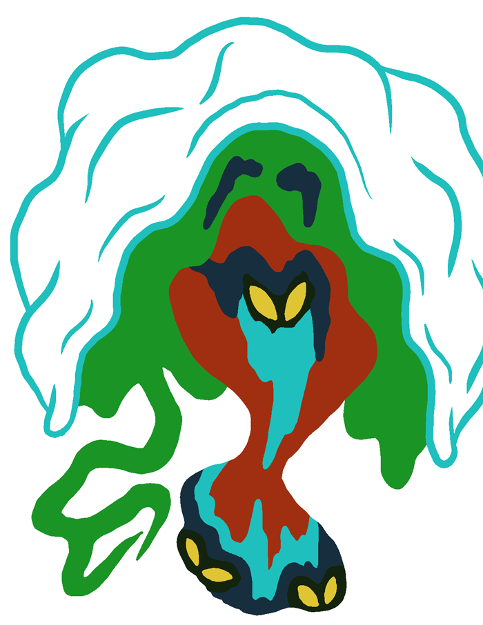
But now I love it! It’s amazingly ugly. His figures are impossibly bulky and stretch in weird, fluid ways. They just seem so big and imposing and in your face which is great for bruisers like Thanos, Thor, and Drax.

Secret Defenders #9 cover pencils by Tom Grindberg
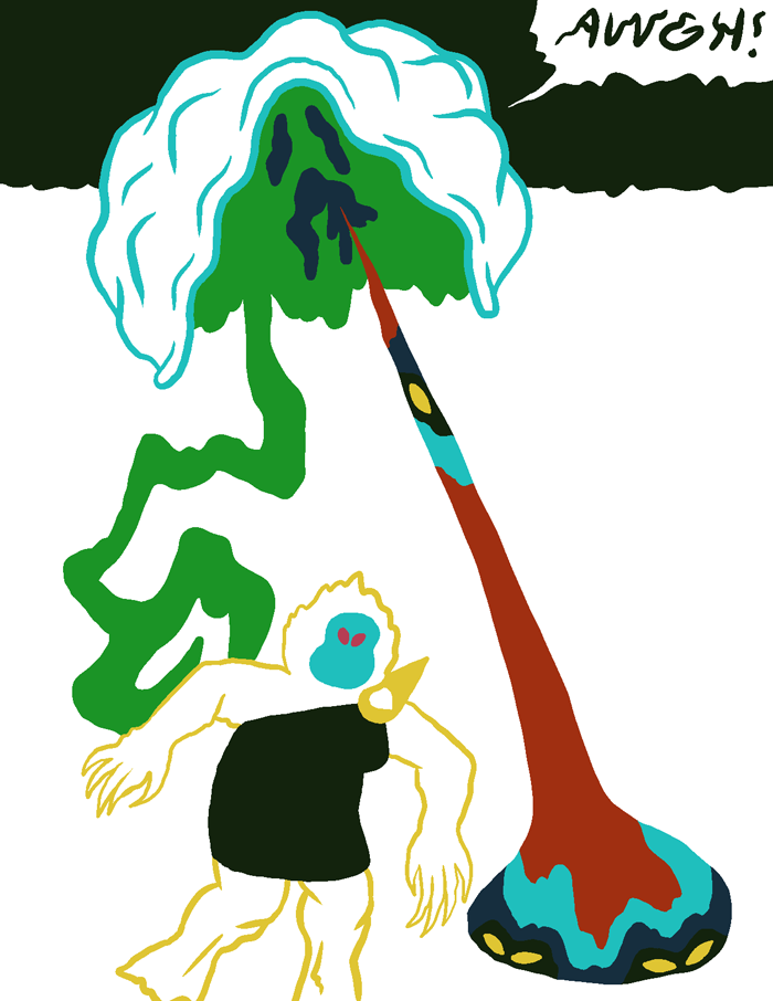
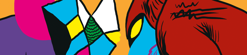
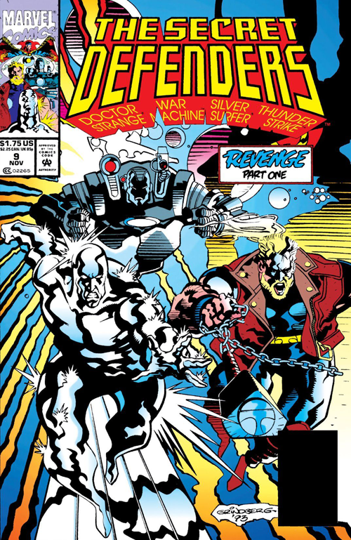
The cover of Secret Defenders #9. Artwork by Tom Grindberg, penciler; Don Hudson, inker; John Kalisz, colorist; and John Costanza, letterer.

It looks weird for someone who’s usually more svelte like the Silver Surfer, Spider-Man, Dr Strange, or Adam Warlock, but I like weird.

Silver Surfer #84 original artwork by Tom Grindberg
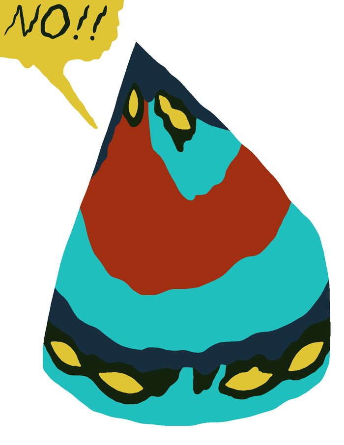
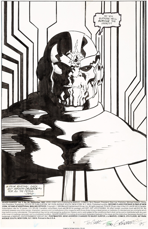
The original art for a splash page from Silver Surfer #84. Artwork by Tom Grindberg, penciler; Tom Christopher, inker; and Ken Bruzenak, letterer.

Overall his renditions of characters look more alive than the stiff figures of more popular artists like Lim and Rob Liefeld. The thick, wavy black lines are out of this world. But what’s strange is that, as far as I can tell, Grindberg only drew this way in 1993 and the first half of 1994. By his next issues of Silver Surfer and Spider-Man 2099, #93 and #25 respectively, he’s much closer to early 90’s Marvel house style. And it didn’t matter whom his inker was – Don Hudson inked Spider-Man 2099 #14, Secret Defenders #9, and Grindberg’s short story in Spider-Man 2099 #25. Someone must have told him to rein it in, which is a bummer.

January 24th, 2017

Watercolor Paintings for the 2016 Kansas City Flatfile Show

Filed under: Artwork — Tags: , , — William Cardini @ 8:56 am

Here are scans of four of the five small paintings that I did for the 2016 Kansas City Flatfile show at the H&R Block Artspace:


“Waterfall Crystal 1,” watercolor and india ink, 6×8 inches, May 2016.


“Monster Crystal 1,” watercolor, 6 x 8 inches, May 2016.


“Monster Crystal 2,” watercolor, 7 x 11 inches, May 2016.


“Alien River Shaman 1,” watercolor, 8.5 x 11.5 inches, May 2016. A riff on a scene from Skew.

It was my first art show in KC! I’m thankful that Glade and I were invited. I had a fifth watercolor that was too big for my scanner and the photos didn’t turn out. Maybe I’ll try to document it again later.

I haven’t done much painting with watercolors. I like how you can mix the colors on the paper by doing wet-on-wet or layering washes. It feels more spontaneous than having to mix all my colors beforehand like I do with my gouache and acrylic paintings.

January 17th, 2017

Brackish by Katie Mulholland and Sarah Welch

Filed under: Comics Criticism — Tags: , — William Cardini @ 9:02 am

I miss Texas. I’ve lived in the Kansas City metro area for almost two years now and I still miss Texas. Strangely I sometimes miss Houston more than Austin, even though I’ve lived in Austin for the majority of 13 years and lived in a suburb of Houston, never the city itself, before that. But growing up in that boring suburb, Houston meant culture and excitement to me as a teen. I drove down there as often as I could, hanging out in coffee shops and wandering through museums. Houston has some really great museums. I’ve spent a lot of time in front Yves Tanguy, Cy Twombly, and Philip Guston paintings.

So when Robert Boyd mentioned this zine Brackish, a collection of great drawings by Sarah Welch and Katie Mulholland, in his write up of Houston Zine Fest 2016, I had to get it. These atmospheric drawings of a transforming Houston make me nostalgic. Here’s one example:

Sarah Welch drawing from Brackish
Brackish page 28, drawing by Sarah Welch.

Sarah Welch’s drawing really transports me. I’ve walked down a residential street like that with the Houston skyline in the background many times. Houston is a swamp but it’s my swamp. The lack of zoning laws makes for some interesting architectural juxtapositions.

January 10th, 2017

Earthseed by Octavia Butler

Filed under: SF Reviews — Tags: , , — William Cardini @ 9:20 am

Octavia Butler’s Earthseed series is two beautifully written, brutal but sometimes hopeful and emotionally devastating epistolary novels, Parable of the Sower and Parable of the Talents, that came out in the 1990’s.

Butler has been on my to-read list for a while. I started with these two novels that are some of the last that she wrote because I heard that in the second novel, America elects a fascist President whose campaign slogan is “make America great again.” Very relevant to our recent election.

Cover for a new hardcover edition of Parable of the Sower by Octavia Butler
Cover for a new hardcover edition of Parable of the Sower coming out in February from Seven Stories Press. I couldn’t find the cover artist on their website.

Parable of the Sower is terrifying because it’s very plausible. Butler portrays a future America that has been devastated by an economic collapse caused by climate change. No one but the ultra rich can afford gas for vehicles. Food is expensive so middle class communities grow their own in gardens and learn how to eat foods like acorns. Many people are homeless migrants walking long roads to escape extreme drought further south. Everyone is so desperate to survive and there is so much crime that no one can afford to be kind. I don’t read a lot of post-apocalyptic SF so I found the breakdown of the social order to be frightening, but if you read a lot of those books this may not affect you as much.

The book is a sequence of diary entries and religious verses by the main character, Lauren Oya Olamina. This format adds to the realism. At first Olamina is introducing you to her walled neighborhood, a somewhat familiar place of relative stability in the chaos. But then she is forced to make a harrowing journey, walking north on California’s highways, surrounded by violent vagrants and fleeing before walls of fire set by drug addicts who experience orgasmic pleasure when they watch flames burn.

Cover for a new hardcover edition of Parable of the Talents by Octavia Butler
Cover for a new hardcover edition of Parable of the Talents coming out in February from Seven Stories Press. I couldn’t find the cover artist on their website.

Parable of the Talents is set five years after the end of Parable of the Sower. At first, the sequel feels less alarming, perhaps because Butler adds introductory texts by other characters to Olamina’s diary entries. Until the halfway point – then a major change in Olamina’s circumstances upset me so much I could barely read it.

There are some spoilers and mention of sexual assault and slavery in the paragraph ahead. Click through to read the rest of the review.

January 4th, 2017

Check out my Comics on Birdcage Bottom Books

Filed under: Print Comics — Tags: — William Cardini @ 8:21 am

J.T. Yost recently had to redo the site of his publishing company and distro, Birdcage Bottom Books. Unfortunately all the old links no longer work.

Check out my new page on the site!

Birdcage Bottom Books new site screenshot

J.T. included me in the anthology Digestate, which is still for sale, and also distributes Vortex and all the still in-print issues of Future Shock.

January 3rd, 2017

2015 and 2016 in Review

Filed under: Recaps — William Cardini @ 9:50 am

Like many progressive American people, 2016 has been an alarming year for me.

I got re-invested in the political process during the primaries. Thinking about the issues led me to finally get to This Changes Everything: Capitalism vs. the Climate by Naomi Klein on my to-read list. This book is a clarion call to agitate for immediate climate action.

And then Trump was elected. In addition to his distressing racist, sexist, and dishonest rhetoric and behavior, his potential nominations for his cabinet are a climate nightmare.

In comparison to the challenges of climate change mitigation and an authoritarian president, my psychedelic space fantasy comics have seemed such an inadequate pursuit. I still believe in the power of stories and that art has transcendent value but I feel so privileged working on comics while the world collapses around me. Especially when I see what activists can accomplish in places like Standing Rock. I’m not sure if I want to make my comics more political or just get more involved with activist groups.

So I haven’t been as productive in 2016 as I was in 2015.

In 2015 I drew a lot and tabled at SPX for the first time. I had pages in four anthologies, Blank Hill Zine, RhiZome #3, Ink Brick #4, and Future Shock Zero. Yeah Dude Comics put out my mini-comic Sphere Fear. I finished Skew Part 3 and a couple other comics for Study Group. I did two large Acrylic paintings as rewards for the Fall 2014 Sparkplug Books Kickstarter.

In 2016 I tabled locally at the KC Zine Fest but didn’t travel to any national shows. I did some watercolor paintings for a couple of KC area art shows. Alternative Comics took over the Sparkplug backstock and then released Vortex through Diamond and produced a digital edition.

My biggest accomplishment was finishing Skew Part 4 and an epilogue. As a reward for reading through this post, here are six pages from Part 4:

Skew Page 183
Page 183.

Skew Page 183
Page 184.

Skew Page 183
Page 185.

Skew Page 183
Page 186.

Skew Page 183
Page 187.

Skew Page 183
Page 188.

One of my goals in 2017 is to find a publisher for a print edition of Skew.

I’ve also been working on another comic that should come out next year. It’s weird to work on comics that I’m not posting as soon as they’re finished. I don’t want to say anything else for fear of jinxing it. And I’m involved in at least one other anthology-ish project for 2017.