Cropped Will Cardini artwork

January 31st, 2012

Interview with Ryan Cecil Smith on SFSF #2

Filed under: Comics Criticism — Tags: , , , — William Cardini @ 7:06 am

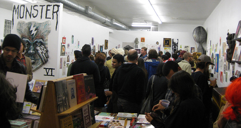
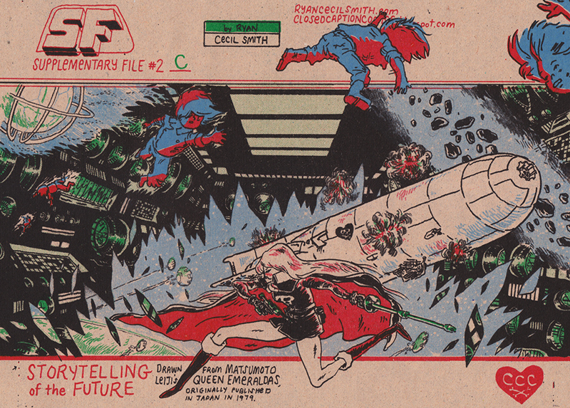
Ryan Cecil Smith is one of the most exciting young artists making comics. His minicomics are meticulously designed, packaged, and printed. After I finished the three parts of SF Supplementary File #2, a beautiful redrawing of some scenes from Leiji Matsumoto’s manga Queen Emeraldas, I had some questions for Smith about his process and intent. I was going to just send him an overly enthusiastic email, but then I thought that some y’all might also be interested in what he had to say. So Smith and I sat down (at our computers in different continents) and shot some questions and answers back and forth (through email).

SFSF2C cover
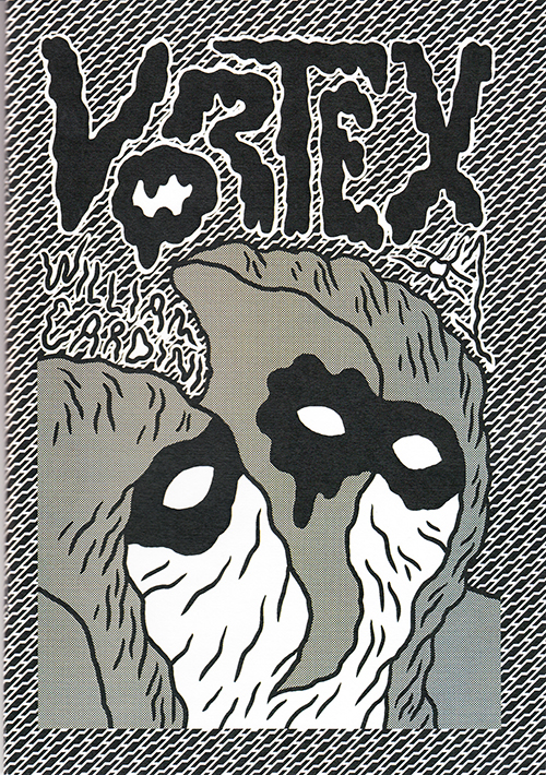
The cover for SFSF #2C, a multicolor Risograph, from Smith’s Flickr.

I’m pleased to present our interview here:

#1: You say on your blog and the cover of the comics that SF Supplementary File #2A and #2B are drawn from Leiji Matsumoto’s manga Queen Emeraldas. Can you tell me more about your process for drawing from Matsumoto’s manga? How do you pick which sections to redraw and how faithful are you to the original work?

Ryan Cecil Smith: In SFSF #2, I was pretty faithful to the original in terms of the content. Like, the panels are laid out the same way and I drew what’s inside all the boxes (mostly). However I tried to draw quickly and not worry about capturing anything of his drawing style. I drew in pencil, between 2B and 10B, so I can’t draw the tightest details, which is good. As for picking the section, well you know A and B and C are all straight, consecutive together. I wonder if that’s not apparent, or is a little confusing? Basically, I chose this segment because I think it represents some great aspects of his work in a small piece of one story. It’s got the long crawls across space, the dreamy narration, and… you know what I mean!

#2: Yeah, it’s clear to me that #2B follows directly on #2A. It seems like #2A starts in the middle of the story, with a battle just ending, which is why I was asking about what segment you selected. Or does the manga not include the build up to Queen Emeraldas blasting the bandit Deathskull across his planet?

RCS: I just thought the preceding part wasn’t as interesting visually, or as a story segment. And I don’t dislike having that conversation about Deathskull as a starting point, in fact I think there is value to keeping it there. To me, this is like knowing the fall of Lucifer occurred between Genesis 1:1 and Genesis 1:2.

Queen Emeraldas by Leiji Matsumoto
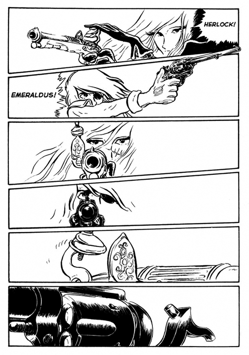
A page from Matsumoto’s Queen Emeraldas, via Sean T Collins.

#3: As far as I can tell Queen Emeraldas has never been officially published in English. Are you translating it yourself?

RCS: I translated it with my friend Andrew Brasher, who reads Japanese much better than I do! He has some translations of music zines on his blog.

#4: You’ve published both minis of your own original stories and minis based on other author’s manga. What draws you to reworking these comics instead of telling more of your own stories?

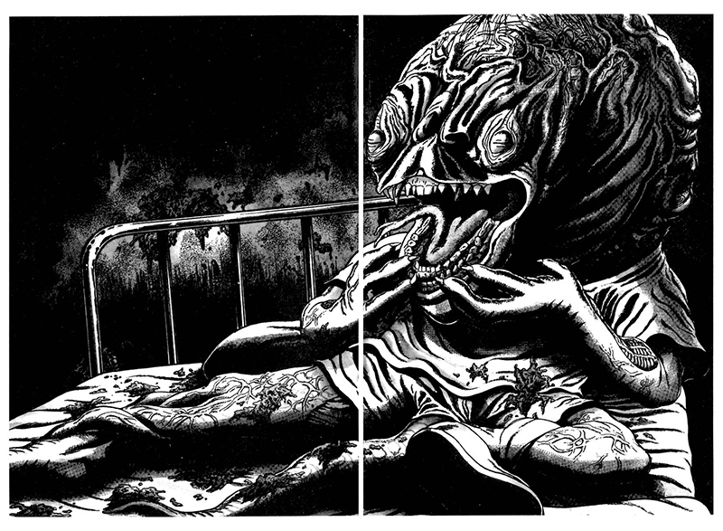
RCS: That’s a great question! I think almost all of my published comics have been retellings or responses to other work. I think maybe I have the strongest urge to create when I see something great (like a movie or book), and my brain is excited, and I want to share my perspective about it. I hope that it feels like a relevant discussion of that thing (like Umezu Kazuo’s Baptism, or Peter Weir’s Picnic at Hanging Rock) and is also an interesting piece of artwork by itself.

Umezu Kazuo monster drawing
A monster drawing by Umezu Kazuo, via Monster Brains.

#5: These Supplementary Files are beautifully printed. I love the risograph printing and the paper they’re printed on. I see they’re printed by Retro Jam Printing in Osaka. How involved are you with the printing? Can you tell me a bit about the printing process for these?

RCS: The way Retro Jam works is you give them the original artwork (digitally or on paper, like I do) and they do all the copies in their shop. I’ve done a lot of printing with them by now, so we have good communication about my particular concerns. I mean, you know a Risograph looks just like a photocopier, so you can easily imagine what the printing looks like. But they have really nice machines, and they have 24 colors of ink. I do my best to prepare good originals for them (I’m talking about having the right contrast, eliminating stray marks, registering everything on paper, etc.) and they print it and do a good job. For me, it’s a little scary handing off a big job to them sometimes, but they’re great at what they do, so what am I worrying about??

#6: Oh wow so a computer isn’t involved in the process at all! Awesome. So if you’re drawing it all in pencil, but also trying to eliminate stray marks and have good contrast, do you do a few drafts of each page or do you just erase and redraw on the same page? Do you use a lightbox to do the registration or are you drawing these on vellum or something transparent?

RCS: Almost every page was a first draft. I treat my originals carefully and I have a process to bring out the best contrast I can get (it’s something like photocopy, white-out, adjust levels, photocopy, re-pencil). I have to use a non-repro blue pencil underneath – that’s how I sketch the layouts, so they don’t get picked up by the Risograph.

Pegacorn Press Risograph ink drums
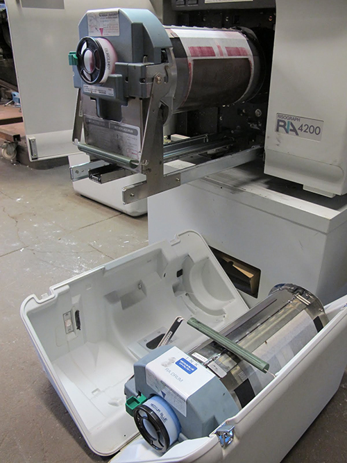
A view of the ink drums of Pegacorn Press’s Risograph.

#7: Do you never use a computer in your comics-making process or is that just something you wanted to do for this project?

RCS: I haven’t used any digital steps in my comics for the last 3 years, with maybe 1 or 2 exceptions. I am not analog “on principle,” but it fits the way I work and the tools I have. In fact I don’t even like scanning my work, because I think I have a crappy scanner! If I was confident in my technological capabilities, I would use a computer more often.

#8: What’s next for you? Are you going to continue the SF series or are you going to do something different?

RCS: Yep, SF #2 is what I’m doing right now. I was working on Two Eyes of the Beautiful III for a while, but it wasn’t working out, so I put it “on hold.” I’d like to continue with that story in the future. I have more ideas for small zines than ideas for bigger projects. I want to make some more work that draws from my real life and my environment.

A spread from SFSF 2C by Ryan Cecil Smith
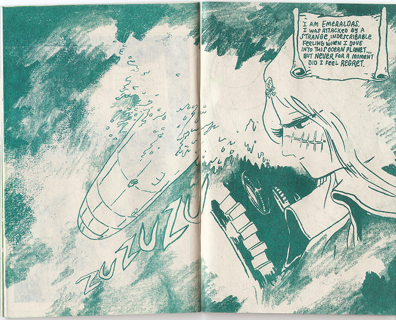
A scan of a spread from my copy of SFSF #2C. You can really see Smith’s pencil marks.

P.S.: Thanks so much to Ryan for taking the time to answer my detailed questions. I’m a process nerd. You can buy all three parts of SF Supplementary File #2 at Smith’s site, as a bundle or separately, or at Domy Books in Austin whenever they have them in stock (they sell out quickly!). If you’re curious about Smith’s other manga redrawing project, Two Eyes of the Beautiful, his life as an American cartoonist teaching English in Japan, and much more, tune your browsers to Ao Meng’s Skype interview with Smith at Novi Magazine.

January 27th, 2012

The Player of Games by Iain M. Banks

Filed under: SF Reviews — Tags: , , — William Cardini @ 7:13 am

Since my last post, I’ve been staying up late burning through The Player of Games by Iain M. Banks. I loved it. This is now unofficial Banks week at the Hypercastle.

The Player of Games by Iain M Banks
Cover by Mark Salwowski, via qualityapeman’s Flickr stream.

The Player of Games is a much better introduction to The Culture than either of the other books I’ve read, Consider Phlebas (the first published Culture book) and Matter. The Player of Games is a tightly structured story of the confrontation between one Culture person, Jernau Morat Gurgeh, and a very different society. Banks is leisurely in the introduction, showing us “the extended cocktail party” that is the Culture, as Russ Allbery put it in his review. In the latter two thirds of the book, Banks shows us the Culture in contrast to its enemy. I’m usually not very taken with utopias but I find the Culture totally captivating. It’s the perfect escape for a feminist leftist rationalist artist. When I allow myself to hope, I dream that the arc of history is bending humanity towards something similar. Therefore I found it especially thrilling when Gurgeh’s story pits his values against an oppressive capitalist interstellar empire that is the dark shadow of our future. Unlike the other Banks sf books I’ve read, The Player of Games has much more thought than action. The conflict centers around matches of a byzantine board game called Azad. We are told that Azad is incredibly complicated but fortunately Banks leaves all but a few evocative details to our imagination. Another intriguing sf conceit in the book is the three-sexed species that rules the Empire of Azad, especially when the narrator breaks the fourth wall and discusses the reasoning behind pronouns choices. Does it make it easier to see the effects of patriarchy through the twisted mirror of an all together alien gender? Outside of the combined critique of capitalism, imperialism, and patriarchy, what I most enjoyed about this book was reading about Gurgeh excelling at the game bouts. There’s something compelling about following the exploits of a highly competent individual. But if you prefer your protagonist to be more relatable, human, and flawed, this is not the book for you.

January 24th, 2012

Matter by Iain M. Banks – Advanced Aliens in Westeros

This past Sunday I finished Matter by Iain M. Banks. It’s the third sf novel by Banks that I’ve read, and each one is a hefty meal of highly visual action on an enormous scale. They are both alternatingly grotesque and funny – I’ve been keeping my wife up half of the night with my guffaws. Imagine my surpise, then, when I read reviews on the Internet and discover that the ones I’ve read (the aforementioned Matter, The Algebraist, and Consider Phlebas) are considered (the first two more so than the tragic Consider Phlebas) to be some of Iain M Banks’ lesser sf works. Considering how they compare to most fsf, I’m eager to read what fans consider his better ones. I wasn’t entirely satisfied with Matter but it was thought provoking.

Consider Phlebas speculative cover by Luke John Frost
I’m not a huge fan of the current covers of Banks’ books and it was hard to find good images of the Salwowski covers, so I was delighted to find these speculative covers that Luke John Frost made for a school project.

In Matter, I thoroughly enjoyed the philosophical detours, witty dialogue, grand vistas, and the concept of a fantasy faux-European setting nested within a space opera galaxy. Any sf cosmos that includes level upon level of more powerful beings is going to get me. That idea is at the heart of the Hyperverse, after all. Although the climax came and went rather abruptly, I liked how Banks subverted my expectations for how the story was going to end up by destroying two thirds of the knot of plotlines with one bold slice. But I also stumbled on some of the book’s flaws. Although the nerd in me reveled in the pages-long aside that described all of the depths and adjectives of the shellworld Sursamen, the early, heavy chunk of exposition dropped me out of the flow. I think that the information could be more smoothly integrated in the narrative. Similarly, a lot of the plot of the book involves the main characters being pulled from place to place by forces beyond their control. Maybe I’ve read one too many long quests in a fantasy novel, but I got tired of that quickly. However, I simultaneously appreciated how the character’s inability to control their fates related to the larger theme of the insignificance of the individual.

Player of Games speculative cover by Luke John Frost
Another speculative cover by Luke John Frost.

What struck me the most was how the themes and plot structure of Matter reminded me of A Song of Ice and Fire by George R. R. Martin. I’ve been thinking a lot lately about the ultimate meaning behind the violence, oppression, and hopelessness that Martin portrays because of Sean T. Collins’ excellent (and rife with spoilers) tumblr All Leather must be Boiled. In multiple posts, Collins analyzes how Martin uses war, realpolitik, and fanatic warriors to condemn the havoc and tragedy that these forces bring to civilization. Replace magic with incredibly high technology (which, as Wizard Clarke has told us, are indistinguishable) and Banks does the same, with both Consider Phlebas and Matter. Things get even more interesting when you add the moral dimension of the Culture to the mix, who try to assist civilizations in developing past systemic violence and oppression, but do so by sometimes fostering those same tragedies. Basically, you could read Matter as the answer to the hypothetical question, “What if super advanced aliens intervened in the conflicts in Westeros and Essos?”

Excession speculative cover by Luke John Frost
A third speculative cover by Luke John Frost.

I wanted to read Excession next, which sounds like the best, but all they had at my local used book shop was The Player of Games and Use of Weapons so I’ll tackle those. I don’t think I’ll read all of Banks’ sf novels in one go though – I like the idea that there are superb sf novels still out there for me that I know I’ll enjoy. If I have any more thoughts worth sharing, I’ll be sure to post them here. If this post has made you curious about Banks, you should read this article by Annalee Newitz on io9 that summarizes Banks’ most popular creation, the Culture, a utopian vision of what our future could be, and has summarizes of the various books. It’s what got me to check him out originally.

January 20th, 2012

Hic & Hoc Logo

Filed under: Artwork — Tags: , , — William Cardini @ 7:21 am

Hic & Hoc is a new art comics publisher that’s got some kewl books scheduled to debut this MoCCA, including my man Pat Aulisio‘s sequel to his Retrofit book Bowman, called (appropriately enough) Bowman 2016.

Bowman 2016 promo image by Pat Aulisio
Bowman 2016 promo image by Pat Aulisio.

Hic & Hoc is currently soliciting drawings of their logo and I thought I’d try it out:

Hic & Hoc logo by

The first ten people to send Hic & Hoc a logo get some free copies of the first Hic & Hoc comics. If you’re interesting I bet there’s still be time, that was posted on Wednesday. The only instructions are that “Hic and Hoc are incompetent pirates’ mateys.” Have at it y’all!

January 17th, 2012

Is Melancholia Possible? An Alternate Ending

I saw Lars von Trier’s movie Melancholia this past weekend. It’s beautiful, epic, and tragic. To sum it up, sublime, in the Romantic sense of the word. It’s like a big dumb object science fiction book but with a much greater focus on human emotion than those kinds of novels typically have.

Rendezvous with Rama by Arthur C Clarke, cover artist not credited
Rendezvous with Rama by Arthur C Clarke, one of the most well-known big dumb object sf books. Cover artist not credited. Via the Internet Speculative Fiction Database.

Whether it’s Melancholia, Rama, the Stone, or Jupiter, we keenly feel the insignificance of our place in the cosmos when we contemplate enormous and mysterious objects of great power.

Melancholia still
A still from Melancholia, via a review on The Wolfman Cometh blog. The reflected light from the Moon and Melancholia casts two shadows.

But after watching Melancholia, my mind is full of more than sublimity and sorrow – I’m also left wondering, “Is that even possible?” Melancholia appears to be a rogue planet, a planet that has been ejected by its original solar system and doomed to wander the galaxy, its path subject to the gravity wells of any random mass it encounters. When a paper was published this past May that calculated that there may be more rogue planets lost in the Milky Way than stars in the sky, rational skeptic Phil Plait posted about the likelihood of one hitting Earth on the Bad Astronomy blog. His conclusion was that, while there’s a chance that a a rogue planet could pass closer to our solar system than the nearest star, it’s extremely unlikely that one would hit Earth. This makes intuitive sense to me – our planet is a tiny blue dot in the cold, black vastness of space.

Eon by Greg Bear, cover by Ron Miller
Eon by Greg Bear, my favorite big dumb object sf book. Cover by Ron Miller. I scanned this from my personal library. Some of the imagery in this book actually inspired parts of my comic VORTEX.

But let’s say a rogue planet did come barreling through our solar system. Even then, the scenario wouldn’t necessarily play out the same as it does in the movie. According to a thread on the Stack Exchange forum for “active researchers, academics and students of physics”, what results from the interaction of three different masses in three different positions traveling at three different speeds (in this case, Melancholia, the Earth, and the Moon, eliding the also relevant influence of the Sun and other planets) is a notoriously troublesome outcome to calculate (it’s called the three-body problem), so who’s the say what exactly would happen if Melancholia passed by the Earth.


Das Eismeer / Die verunglückte Nordpolexpedition, Die verunglückte Hoffnung (1823-1824) by Caspar David Friedrich, a Romantic painter of the sublime. Via Sights Within.

One possibility, more likely than destruction, is that the gravitation influence of another, much larger planet would fling Earth out of the solar system. Rather than a fiery cataclysm, it would be a slow decline. The Sun would grow more distant each day. Global cooling would replace global warming. The oceans would slumber under a thick crust of ice. Carbon dioxide would fall from the sky like snow. Once the atmosphere froze to the surface, the stars would harden to unblinking knives of light. The remaining energy of the earth’s molten core would feed small pockets of microbial life in a subsurface ocean but it would be a lonely, cold existence soaring through the eternal night.

January 13th, 2012

Carlos Victor Ochagavia

Filed under: Inspiration — Tags: , , , — William Cardini @ 7:30 am

In honor of the fifth anniversary of Robert Anton Wilson’s death, BoingBoing has been posting about him all week, and in one of the posts, Gareth Branwyn put up a picture of the original paperback editions of RAW’s Illuminatus! trilogy:

Illuminatus! trilogy by Robert Anton Wilson, covers by Carlos Victor Ochagavia

I thought the covers were so cool I dug up more images of book covers by the artist, Carlos Victor Ochagavia. Here are his covers for two books by Keith Laumer from Cadwalader Ringgold’s Flickr photostream:

Retief's War by Keith Laumer, cover by Carlos Victor Ochagavia

Retief and the Warlords by Keith Laumer, cover by Carlos Victor Ochagavia

Also, check out this dope poster of monsters from Greek myths by Ochagavia that I found in WesternOutlaw’s Flickr photostream:

Guide to the Monsters of the Greek Myths by Carlos Victor Ochagavia

I find this one especially exciting because I just finished reading all of Jesse Moynihan’s webcomic Forming that involves some Greek myth.

January 10th, 2012

The City Troll Kickstarter

Filed under: Events — Tags: , , — William Cardini @ 11:15 pm

My buddy Aaron Whitaker, who posts comics with his girlfriend Melinda Tracy Boyce on the Gingham Ghost tumblr, is using Kickstarter to raise money to print his first graphic novel, The City Troll.

Check out the dope cover:

Cover for The City Troll by Aaron Whitaker

The City Troll is about a guy named Paul who dislikes himself so much, he sees himself as a slimy troll. Over the 180 pages of the book he navigates his inner world of self pity and the outer world of relationships and family. Aaron let me peek at some of the sketchbooks he’s been drawing The City Troll in and I’m really looking forward to reading the whole thing. But don’t take my word for it, watch Aaron’s Kickstarter video and see if that piques your interest:

If you want to see a sample of Aaron’s cartooning chops, check out this pizza mutants one-page comic I dug up from deep in the Gingham Ghost archive:

Aaron Whitaker comic

Aaron’s almost 70% of the way there, help him get that remaining 30% by Tuesday, February 7th!

January 6th, 2012

RUB THE BLOOD Art Show Tonight in Philadelphia

Filed under: Print Comics — Tags: , , , , , — William Cardini @ 7:34 am

Tonight, from six to nine pm at the Philadelphia comic book store Brave New Worlds, is an art show of drawings done by contributors of RUB THE BLOOD that’re either related to the theme of the anthology or original pages.

Here’s the flyer:

RUB THE BLOOD flyer

I’ve got two 7×10″ ink drawings of the two characters I created for my RUB THE BLOOD contribution, Lightbeam and Bludwurld the Living Battle Planet, in the show. I also sent them some copies of VORTEX. Check out Ian Harker’s Secret Prison post about the show for more information, including a pic of the installation, and instructions on ordering RUB THE BLOOD through the mail.

January 3rd, 2012

News from the Holidaze: Austin Scene Report, VORTEX News, Site Update

Filed under: Admin,Print Comics — Tags: , , , , — William Cardini @ 7:36 am

Hey y’all, welcome back from the holidaze! A few things happened while I was getting too merry that deserve their own blog posts but I’m just going to sum them all up here:

Austin Scene Report

I wrote up a report on Austin’s comics scene for Frank Santoro’s column on the Comics Journal site.

Monster Show 6 opening
The opening of Monster Show 6 at Domy Austin from the Monster Show 6 Flickr stream, photo by Carling Hale.

Apologizes to anyone that I didn’t include. Please don’t take it personally, I was trying to be concise, comprehensive, and art comics centric.

VORTEX News

Whitey reviewed VORTEX on Optical Sloth on December 24th. He proclaims the battle to be “suitably majestic” and accurately leaves the gender ambiguous.

VORTEX #1 cover
I snagged this from Whitey’s site because his scanner caught the weird primary color gradient that emerged from the printing process.

Also, orders made through my online store will now be shipped much more quickly. Thanks to everyone who ordered over the last two weeks, your orders will be shipping soon.

Site Update

Over the break I fiddled around with my site.

Hypercastle site

I updated the header so that the banner randomly changes every time you load a page, changed the splash image to a randomly selected one-page comic, streamlined the content, and drew a new favicon. Please let me know if anything breaks on you.